Explore Murrieta
Challenge
As a growing destination in Southern California, Murrieta needed a brand that could unify its message, reflect its energy, and hold its own in a crowded Southern California market. This brand refresh wasn’t about reinventing Murrieta. It was about sharpening the edges, dialing up the distinction, and building a brand system that could flex across seasons, audiences, and platforms—without losing sight of what makes the place unforgettable.
Approach
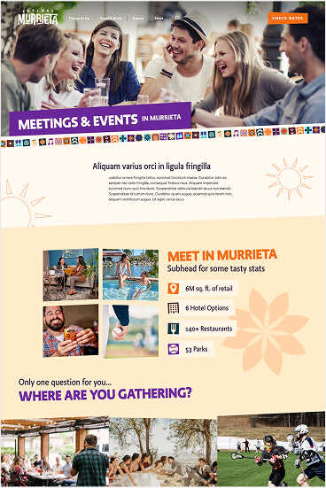
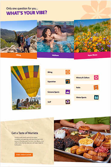
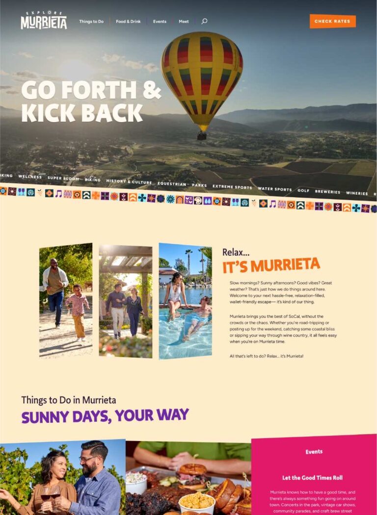
We led a comprehensive brand refresh designed to unify Murrieta’s visual and verbal identity—creating a system that highlights the destination’s authenticity, affordability, and relaxed energy. Guided by stakeholder insights, regional research, and a strong vision for growth, the new brand was crafted to reflect what makes Murrieta truly one-of-a-kind. The updated identity positions Murrieta as a relaxing, affordable Southern California alternative—ideal for families, wellness travelers, and road-trippers. The brand also captures the city’s dual personality: a place where laid-back charm meets just the right amount of liveliness.
Brand System Highlights
- Positioned as a Relaxing, Affordable SoCal Alternative: Differentiates Murrieta from the rush of surrounding destinations by emphasizing ease, value, and a slower pace— without sacrificing experience.
- Dual Personality with Broad Appeal: The blend of liveliness and laid-back charm gives Murrieta mass appeal—from outdoor adventurers to wine tasters, festival-goers to wellness seekers.
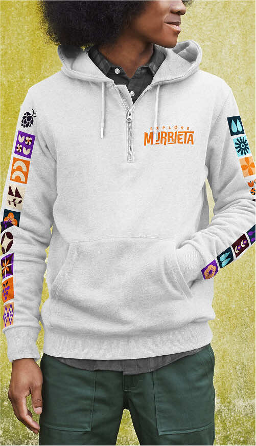
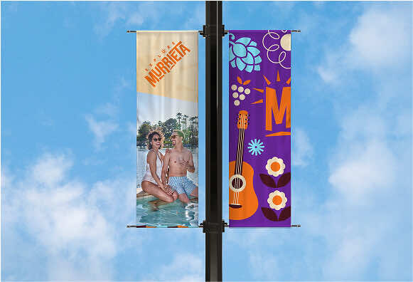
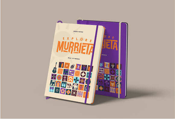
- Visual Identity Rooted in Warmth & Celebration: A sunny orange palette, playful typography, and sun icon reflect the region’s festive, inviting spirit—conveying that Murrieta is not just a place, but a mood.
- Authentic, Welcoming Brand Voice: The casual, celebratory tone of voice and brand promise (“Less hassle. More relaxation.”) make Murrieta feel friendly and real—not overhyped or artificial.
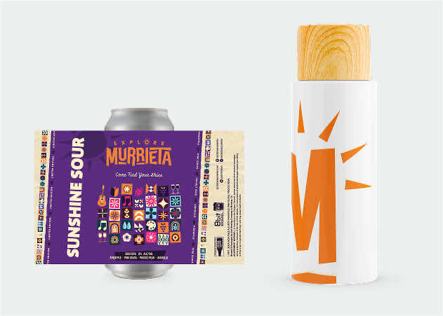
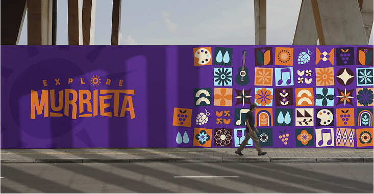
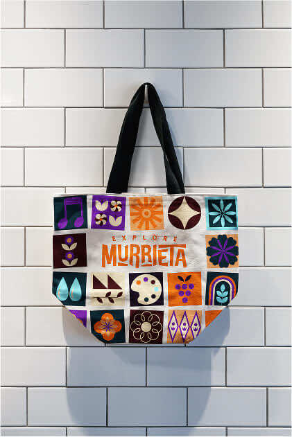
- Strategic Use of Local Color and Culture: Design elements like “cultural tiling” and a Spanish-influenced visual system connect back to local heritage and elevate regional pride.
- Photography That Reflects Real Moments: Organic, natural photography shows visitors what genuine, everyday joy looks like in Murrieta—building emotional connection and aspiration.
- Built to Support Year-Round Tourism: The brand story promotes Murrieta as a sunny, multi-season destination with something to enjoy every month—from hikes to hot springs, events to vineyards.
- Flexible and Cohesive Identity System: A well-developed visual toolkit—including logo variants, colors, and patterns—ensures consistency across digital, print, signage, and merchandise.